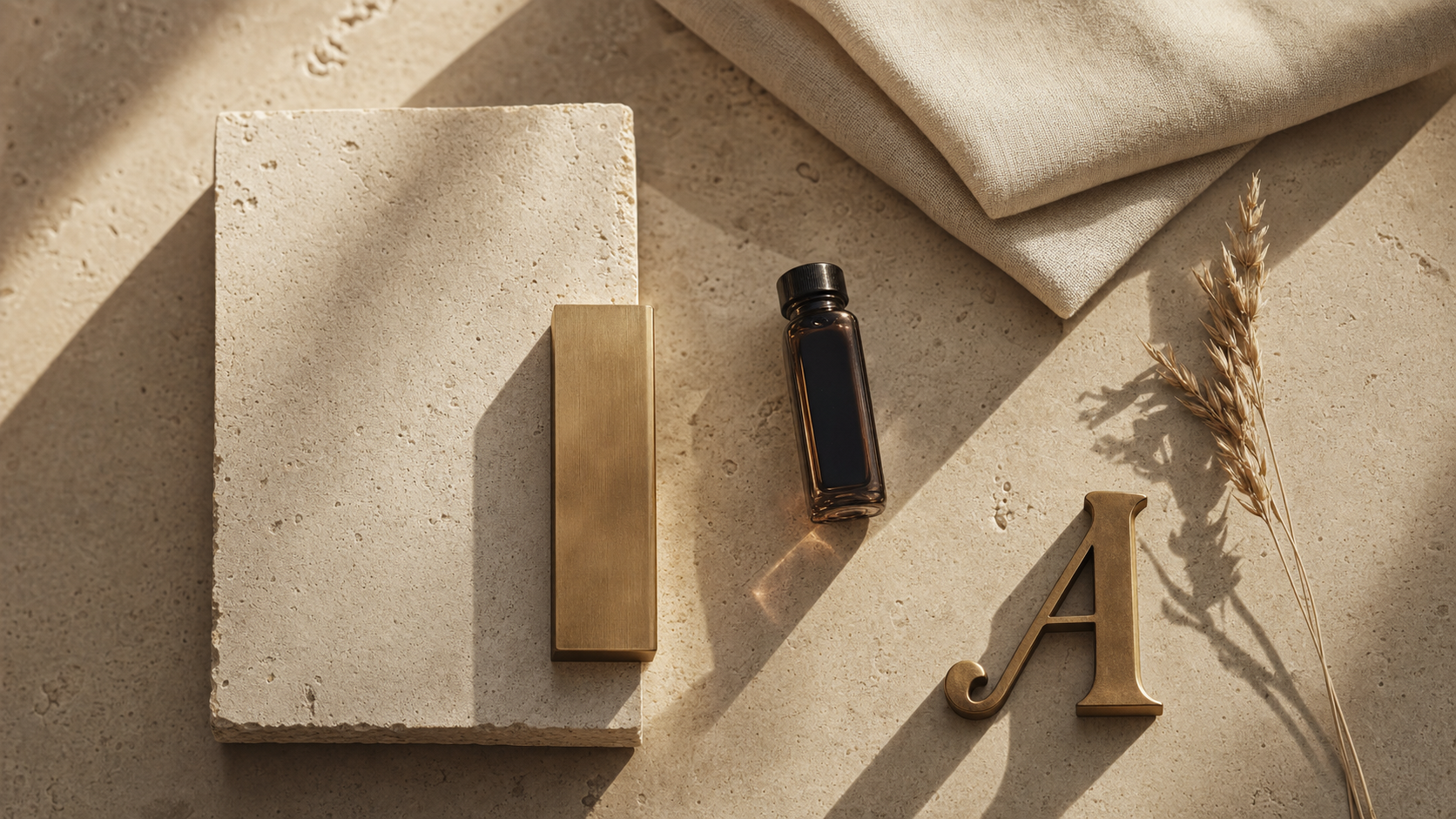
Every founder I've spoken to in the last six months wants their site to feel "premium." When I ask what premium means, I get one of two answers. Either they show me Vercel-black-with-neon-gradient, or they show me a Notion page. Neither of those is premium. The first is exhausted. The second is a productivity app. Premium is a hotel lobby. Premium is a private banking floor. Premium is quiet.
The palette
Warm Architectural Luxe is five colors. Bone. Travertine. Linen. Espresso. Brushed brass. That's the whole system. Every luxury interior you've ever wanted to sit in is some version of these five, and there's a reason.
Why warm instead of cool
Cool palettes read as technology. Warm palettes read as hospitality. The moment your site turns warm, the buyer's read of the brand shifts from "this is a product" to "this is a place." Places charge more than products. Always have.
This matters most for the industries that price on trust — doctors, lawyers, wealth managers, boutique hospitality. If your site feels like a login screen, you are competing on features. If your site feels like a foyer, you are competing on standing.
Why OKLCH and not hex
OKLCH lets me tune lightness without shifting hue. When I need travertine at 88% lightness for a card background and 94% for the page under it, the two swatches stay perceptually related. Hex won't do that. HSL sort of does. OKLCH gets it right.
The chrome-noir aesthetic became a signal for AI-generated. Warm architectural luxe is a signal for someone showed up in person.
Where it doesn't work
This palette is wrong for fintech dashboards. It's wrong for developer tools. It's wrong for anything that trades on data density. Warm luxe is a palette for the human-scale industries. If your product is a spreadsheet, it will look like a candlelit spreadsheet, which is worse than a normal spreadsheet.
Use it where the sale is emotional. A concierge medical practice. A litigation boutique. A single-family office. A destination spa. The four industries I've shown as sample sites are the four industries this palette is built for.